Monday, December 14, 2015

Merry Christmas

The holiday season is certainly here...life is busy, but not frantic at our house. With the temperature in the upper 60's, it doesn't feel like Christmas, but the calendar belies that! It's Christmas card time.

I'm ready this year - last summer I had this idea... I was feeling a little 'sassy' and thinking "Wouldn't it be great to get the card done early?" No pressure, just play with an idea and see.

So, I did this watercolor and ink painting of the alphabet. I decorated each letter with a Santa hat and ornament or ribbon. This is the front of the card.


Okay, something is missing... open the card and it says...

Merry Christmas, everyone!


Saturday, December 5, 2015

The final peppers

Remember the peppers - 10/29 and 11/12 posts? I wondered if I would ever be finished... What I decided after looking at that painting for a long time was that I had killed it. Those fresh peppers were no longer glowing. All the work fiddling with the window behind the peppers had made the painting be about the window - it wasn't what I had intended.

What I know is that it is important to see where a painting goes in spite of me. Sometimes during the process a painting can lead me way off into unintended places and that can be a good thing. The 'happy surprises' of art. However, this time i just ended up with a dull painting. It's best to turn it over and start again (or not).

What was also important for me in this exercise was to try something different. My friends in the watercolor class had made suggestions and I tried them. No, they didn't work for me, but it was good to try something 'out of my box.'

So, what did I do? After all that, I got out a fresh piece of paper. I had already cut a mat, bought glass and a frame for the old painting - didn't want all those things to go to waste. I repainted my original idea.

It's simple, clean and fresh...and it's hanging in the library gallery in St Michaels as part of the watercolor exhibit sponsored by the St MIchaels Art League. The show will be there for the month of December. Stop by and have a look.

"Come on Over"  12 x 22 framed watercolor   $165

Friday, November 27, 2015

Painting loosely

Each year the St Michaels Art League (SMAL) schedules two nationally know painters to come to our area for multi-day workshops. This fall Eric Weigardt came for 5 days. Unfortunately, I had a schedule conflict and was not able to sign up for the workshop. But, I did go one morning to see his demonstration. A few of my friends had taken classes from him and now I know why.

His easy, loose style creates a freshness in his watercolors that is so appealing. He offers a set of videos - which SMAL promptly bought. I have now watched all six - and want to watch them again and again.

One of the videos was on flowers - basically watching the edges and white spaces. Not to worry with all the petals - knowing it is flowers, I just do enough to suggest 'flower.'

Last week I thought it would be fun to just try it. I started with lots of pinks, gradually adding some darker reds. Then threw in some greens (blues and yellows) and painted in the container using the colors I had already used.


After it dried, it looked a little pale - I added some darks and decided to stop and just look at it for several days.


I think there is a wonderful freshness to this. I had a great time  - I want to try this some more.

Thursday, November 12, 2015

Peppers, part II

Yeah, the peppers again... When I took the pepper painting to class the following week, everyone liked it...and then there was a discussion about adding some drama. Some of the students had been using very dark backgrounds in their paintings lately. What would that look like with the peppers?

I agreed the painting could use some darks, so I began experimenting. The voice in my head kept repeating, "It's only paper..." After all, I am taking a class - I need to experiment!

Here is the first attempt. I wanted it to still look like reflected glass...


I didn't like that particularly, so I washed it off and tried again.


Hmmm, maybe a little better. What about solid dark?


Well, that's dramatic all right, but now it's all about the window and not about the peppers! I showed this one to my class this week. They agreed, it was too much. They liked the other two pictured above (I had printed out the various iterations). Suggestion: use a sponge and wipe off some of the dark so the window has the streaked look...and let the streaks cross over the window frame to break up the sharp white lines.


I feel like the little kid in the backseat on a long trip..."Are we there yet?" ...


Thursday, October 29, 2015

"Come on Over" or "Green with Envy"

I received a phone call and was told to bring fruits or veggies to class for a still life painting. I had been at the grocery store the previous day and had spotted some beautiful peppers. I picked out three - a yellow, an orange and a green.

Others had brought a pomegranate and a pineapple. Each of us brought what we wanted to paint, so instead of combining everything for a joint still life, we just individually arranged what we had.

My idea had been to paint the orange and yellow peppers on one side of the paper and the green one by itself.  I was thinking "Come on Over" or "Green with Envy."

The first day I completed the sketch. The following week, it was time to paint. I really wanted to paint loosely, so I purposely held the paint brush a different way and voila, I had the peppers done in no time.

The class loved it and asked, "What else are you going to do?" There were suggestions of adding a dishtowel, or some sort of tiles. That didn't seem quite right. Maybe a window...

I sketched in a window and then worked hard at getting the panes the same size. I used blue painter's tape - which comes off easily ...and arranged and rearranged the panes. My eye gets fooled so easily - they still don't look even, but they are!


Then I pulled off the tape so I could see how it might look.


Last step was painting in the window panes. In keeping with the looseness of the peppers I purposely did not do lots of detail in the window frames. I like the simple look in this one.


So, what you do you think - "Come on Over" or "Green with Envy"...or something else?


Monday, October 5, 2015

BFFs

The process - part 2...the October exhibit at the St Michaels Library was hung last week. I need to get by there and see what the other artists did in describing their processes. Creative people = imaginative ways of doing this 'assignment.'

Today's post is about the pastel that I painted for this exhibit. I haven't done a portrait for awhile so I started looking through old photos. I came across a picture of one of my grandchildren hugging her dog.  She was about 2 at the time. (She's now 16 - don't know how that happened!)

Here's the pencil sketch on 500 grit sanded paper. (FYI - this really is just like sandpaper, but it's archival - not the stuff from my woodworking days)


I love the look of watercolor washes before I begin using my pastels. I try to add just enough color to describe the painting. It helps me find the darks and lights.


After it dried, I began with my soft pastels. Again, I was working on darks and lights and beginning to work on some expression in her face - because I couldn't wait. Normally, that would come later. but i was anxious to try.


I started experimenting with background color. In the photo, they were in the grass.


I finished up the background and kept doodling with her mouth - she has a funny little expression that is peculiar to small children. I think it has something to do with 'baby' cheeks...


The title of this painting is "BFFs" - it seems they were Best Friends Forever.

Friday, September 25, 2015

Creating Art - the Process

The art league will have a new exhibit at the St Michaels Library in October. It's called 'Creating Art - the Process.' I have found it a lot of fun - and good learning  - to document my process in creating a painting. . .now I will get to see how other artists take on this challenge.

So, here is one of the paintings I will be entering in this exhibit. After I painted 'THE Arrangement' (see post of September 10) I thought it would be fun to try taping another piece of watercolor paper. The first painting was horizontal - this one would be vertical.

My idea for this painting was to just use blue and yellow and see what would happen. This first application of color was very wet. I love to see what the colors will do! When watercolor paint dries, the colors are more muted.


I added more color - with less water this time - and let it dry again. Then I removed the tape. (forgot to take a picture before the next step)

I wanted to bring the sections together so I dabbed a sponge in the blue-yellow-green puddles on my palette and crossed over some of the white lines.


It's looking very much like a lattice. I know I am sort of color crazy - I had a teacher once who said "Every painting needs a spot of red." At this point I hear his voice in my head and can't shake it. . . but, I also don't want to ruin what I have done already. 

It's time for the acetate - clear plastic that I can experiment with on top of my painting. I can paint on it and get an idea of what might work. I try a few different ideas. 


Still not right. Then I decided to stop and take this painting to class for suggestions. 

 "Make the flower look like a real flower." "Add a vine. Make it look like it really belongs there."

After googling 'flowering vines and morning glories' (which are NOT always blue/white as I had thought - yea, I can use red),  I made several more acetate tries and came up with this final product.
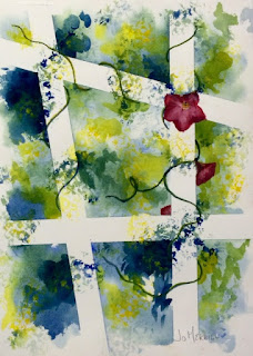
"The Lattice" - 16x20 framed watercolor $175
The exhibit will be hung on October first and run through the month. Drop by, see this painting and find out how other artists create, too!