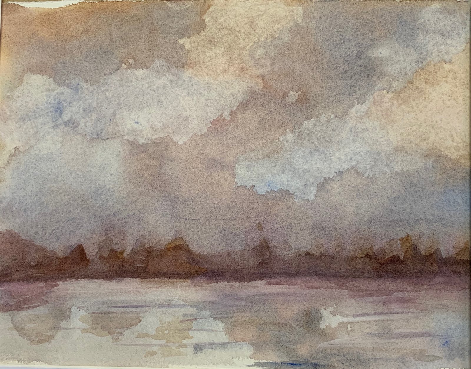
In my last post, I wrote about my (sort of) aversion to landscape paintings. I find the stability of horizontal/landscape paintings is not inspiring for me. However, since my class was committed to work on skies, I decided to try to find the excitement of what I like about a vertical painting.
I again began with wet paper, but this time it was vertical. Unfortunately, I did not take photos of this process...I got too carried away with what I was doing! I used the same blue, red and yellow combination and 'globed' paint at the top of the paper.
I watched at it began to run down. When it slowed, I sprayed water on it in different places and continued to put more paint here and there. Spray...paint...spray...paint... The colors were amazing! The drips created interesting shapes!
After it dried (that took awhile!) I darkened a horizon line and added a little soft color to the water.
Yeah, my horizon line is a little off...I'll fix that. But, I love the action and color in this! I guess I basically painted this sideways! Who knew you could do that?
Monday, October 14, 2019
Friday, October 11, 2019
Skies
My art group decided that we all needed to work on/experiment with painting skies. We talked about sky and water and reflections...what colors/triad to use...how to make the clouds interesting... - a helpful discussion.
One thing I know about myself is that I really am not much interested in painting landscapes...skies and land. There is something too stationary about a horizontal plane. I find that I do better work on a vertical piece of paper.
So, I began experimenting...we had had a lot of discussion about triads. I began with wet paper and ultramarine blue, alizarin crimson and aureolin yellow. It's a stormy look with just the suggestion of a horizon.
I let it dry and then darkened the horizon line and added a few more lines to the water.
The thing about triads that I am learning is that the same colors can represent so many different moods. This sky painting uses the same colors and is the more 'traditional sky.'
I again began with very wet paper. Obviously, I used lots more blue in this one. This particular blue granulates and adds texture to the sky. You can see the streaks of color. I don't much like this one - I think it's boring...
On to one more...I do think yellow skies are interesting.
I cut back on the blue - except to add it to yellow and make some green fields. I started to make a structure in the background and ended up just leaving it. I may go back to this one day and tweak it some more. This reminds me a little of the vistas in the midwest. You can see for miles!
Now, a teaser for my next blog. I did one more sky when I got to my class the following week. It is quite dramatic and deserves it own post. As 'they' say..."Stay tuned!"
One thing I know about myself is that I really am not much interested in painting landscapes...skies and land. There is something too stationary about a horizontal plane. I find that I do better work on a vertical piece of paper.
So, I began experimenting...we had had a lot of discussion about triads. I began with wet paper and ultramarine blue, alizarin crimson and aureolin yellow. It's a stormy look with just the suggestion of a horizon.
I let it dry and then darkened the horizon line and added a few more lines to the water.
The thing about triads that I am learning is that the same colors can represent so many different moods. This sky painting uses the same colors and is the more 'traditional sky.'
I again began with very wet paper. Obviously, I used lots more blue in this one. This particular blue granulates and adds texture to the sky. You can see the streaks of color. I don't much like this one - I think it's boring...
On to one more...I do think yellow skies are interesting.
I cut back on the blue - except to add it to yellow and make some green fields. I started to make a structure in the background and ended up just leaving it. I may go back to this one day and tweak it some more. This reminds me a little of the vistas in the midwest. You can see for miles!
Now, a teaser for my next blog. I did one more sky when I got to my class the following week. It is quite dramatic and deserves it own post. As 'they' say..."Stay tuned!"
Sunday, September 22, 2019
Rise
There is another show coming up at the Art League of Ocean City. This one is called Rise - "Rising above adversity and empowering women through art." I thought it would be a good challenge for me. I like the idea of painting 'ideas' - not just paintings 'things.'
I had this idea of being unchained...and I love the idea of rising. So, I began with a pencil sketch and then ink. A simple sky with some clouds...
I like the challenge of drawing chains. It took a few tries before I got the right size.
Then, I looked up the symbol for female. It is actually the astrological symbol for Venus. It is said to represent a bronze mirror with a handle. (I had not known that.)
I wanted the women to be different sizes, shapes and colors.
I took it to class and it was suggested that a few more women would be nice and work on connecting them. A bit more contrast and definition on the chain and ...
I'm anxious to see what other artists have done. The show runs for the month of October.
Thursday, August 29, 2019
Blue
A few weeks ago a friend sent a notice about an art show in Ocean City, Maryland that had "Blue" as its theme. I thought that was an interesting challenge...
But, our art league has its annual Labor Day Show and Sale coming up this weekend and I had been pretty busy getting paintings ready for it. About a week ago, I had everything framed and ready to go. Well ahead of time...
It was then that I began to think 'blue'... As I was cleaning up my painting space, I discovered two blocks of watercolor paper that I had been given. It was not the brand of paper that I usually use - it would be nice to get rid of it by experimenting on it. I also had a tube of Ultramarine blue that I wanted to get rid of (it had a terrible odor)...
Then I found some of the experiments that I had done on yupo paper. I could 'repurpose' them. I decided to wash this one off and see what else I could do with it.
Interestingly, when you wash yupo, some of the staining colors (red) won't come all the way off - I had sort of a pink design left over. I wet the paper and began dropping on the ultramarine paint. I added a little indigo to have some darks. Then I stood the painting on an end so that the dripping paint would run and create interesting patterns. I let it dry and voila! The original 'pink' painting I think enhances these new colors.
So, on to some other ways of playing... I enjoyed the wet dripping paint. Here is another: I began with wet paper and just let the paint run.
This time I mixed the ultramarine with another color called June Bug. It's more toward green. I let the paint continue to drip down.
When the paper is really wet the color looks faded. I kept adding color and as the paint began to dry I used my spray bottle to give it some texture. But, I think I added a little too much water. When I picked it up.some of the drips ran off at an angle! I also tried looking at it from different directions...
It was getting more interesting... I spattered it with a little white gouache and cut a mat so that I could crop it a little...
I'm calling it "Winter."
Now, I am on a roll... playing with paint! I began with a large sheet of paper. I did not wet the paper this time, but instead dropped some very wet paint on it in three places. Then I got out some straws and blew the paint around. That is always fun and surprising...there is no way to know where the paint will end up!
And finally, I decided to use masking fluid... I had never tried masking quite like this. I poured a little of the fluid on the paper and blew it around with the straws. I set up two paintings this way. It takes a while to dry. (like overnight)
The next day, I wet the paper on the first one and really slopped on some blue. I surrounded it with yellow and watched as the greenish/yellow mixed around the masked image. It was very wet - lots of drips!
The second image was done in a similar way although with not quite so much color. As the paint on this one was drying, I sprayed it to find some texture.
But, our art league has its annual Labor Day Show and Sale coming up this weekend and I had been pretty busy getting paintings ready for it. About a week ago, I had everything framed and ready to go. Well ahead of time...
It was then that I began to think 'blue'... As I was cleaning up my painting space, I discovered two blocks of watercolor paper that I had been given. It was not the brand of paper that I usually use - it would be nice to get rid of it by experimenting on it. I also had a tube of Ultramarine blue that I wanted to get rid of (it had a terrible odor)...
Then I found some of the experiments that I had done on yupo paper. I could 'repurpose' them. I decided to wash this one off and see what else I could do with it.
So, on to some other ways of playing... I enjoyed the wet dripping paint. Here is another: I began with wet paper and just let the paint run.
This time I mixed the ultramarine with another color called June Bug. It's more toward green. I let the paint continue to drip down.
When the paper is really wet the color looks faded. I kept adding color and as the paint began to dry I used my spray bottle to give it some texture. But, I think I added a little too much water. When I picked it up.some of the drips ran off at an angle! I also tried looking at it from different directions...
I'm calling it "Winter."
Now, I am on a roll... playing with paint! I began with a large sheet of paper. I did not wet the paper this time, but instead dropped some very wet paint on it in three places. Then I got out some straws and blew the paint around. That is always fun and surprising...there is no way to know where the paint will end up!
And finally, I decided to use masking fluid... I had never tried masking quite like this. I poured a little of the fluid on the paper and blew it around with the straws. I set up two paintings this way. It takes a while to dry. (like overnight)
The next day, I wet the paper on the first one and really slopped on some blue. I surrounded it with yellow and watched as the greenish/yellow mixed around the masked image. It was very wet - lots of drips!
The second image was done in a similar way although with not quite so much color. As the paint on this one was drying, I sprayed it to find some texture.
The fun thing about masking fluid is to see what happens when it is removed. The yellowish dried mask keeps the paper hidden...
Finished paintings...
So, here's the surprise ... I took all these crazy paintings to my class this week and everyone loved them! In fact, they all said to put them in the show this weekend! I have spent the past two days matting and framing and am now ready to go with a brand new display.
Invitation to all... stop by St Luke's Church in St. Michaels on Saturday - 10-5 or Sunday 12:30-5 and see all these in person! I'll have all of them for sale and a few other things, too. Copies of the book that I illustrated "Thoughts from my bench" will be available also!
Wednesday, August 7, 2019
Kieran
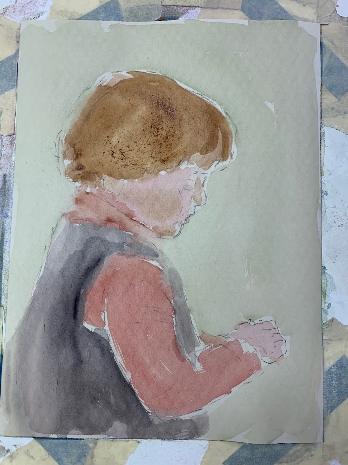
Kieran, my 16 year old grandson, lives in Vermont. He and his sister recently came for a summer visit. I painted this portrait before they came and hung the framed painting over his bed.
I had gone back in my photo file looking for a picture of him that would be fun to reproduce. I had always loved this one. We were visiting in November and had gone out looking for a small Christmas tree to cut down and decorate. We set the tree up in the living room between two windows and as the kids began to put decorations on it, the light made behind him just made him glow. I love the softness of this.
I began sketching on 600 grit UArt pastel paper and then did a watercolor underpainting.
I began adding pastel...
I continued to add definition...
And then some highlights.
In the original photo, his hand was partially covered by a tree branch as he was hanging an ornament. I did not want the distraction of the tree...so what to do with his hand? I asked the artist friends in my class what they thought and we talked about a favorite toy.
So then I went back to the photo file and looked at various toys... he was really into Spiderman...I sketched that in...
Oh, no! It looks like he is squeezing Spiderman!
Hmmm, he's all boy...maybe holding a frog...
No way... I knew I didn't want to add a new color...as in 'frog green.'
I liked the color palette that I had already established. Maybe just something of color in his hand that would not call attention to itself. After all, I want to look at his expression, not focus on his hand.
So, now I have a mystery toy (maybe a ball?) and need to finish up. I realized that his face was partially lost into the background so I darkened the area behind him and strengthened the highlights on his face and clothing.
I could probably keep tweaking this for days to come, but knew I needed to get it behind glass and into a frame or I would 'work it to death.'
Hard to believe that he is now taller than I am and old enough to drive!
I had gone back in my photo file looking for a picture of him that would be fun to reproduce. I had always loved this one. We were visiting in November and had gone out looking for a small Christmas tree to cut down and decorate. We set the tree up in the living room between two windows and as the kids began to put decorations on it, the light made behind him just made him glow. I love the softness of this.
I began sketching on 600 grit UArt pastel paper and then did a watercolor underpainting.
I began adding pastel...
I continued to add definition...
And then some highlights.
In the original photo, his hand was partially covered by a tree branch as he was hanging an ornament. I did not want the distraction of the tree...so what to do with his hand? I asked the artist friends in my class what they thought and we talked about a favorite toy.
So then I went back to the photo file and looked at various toys... he was really into Spiderman...I sketched that in...
Oh, no! It looks like he is squeezing Spiderman!
Hmmm, he's all boy...maybe holding a frog...
No way... I knew I didn't want to add a new color...as in 'frog green.'
I liked the color palette that I had already established. Maybe just something of color in his hand that would not call attention to itself. After all, I want to look at his expression, not focus on his hand.
So, now I have a mystery toy (maybe a ball?) and need to finish up. I realized that his face was partially lost into the background so I darkened the area behind him and strengthened the highlights on his face and clothing.
I could probably keep tweaking this for days to come, but knew I needed to get it behind glass and into a frame or I would 'work it to death.'
Hard to believe that he is now taller than I am and old enough to drive!
Saturday, July 27, 2019
Maizie
WOW, what a summer...It's been too hot to paint or do anything. I found myself taking pictures of the thermometer...fried brain entertainment. One day last week it was 104 with a heat index of 113. Thankfully, a cool front came through and today it's only 90...
I am now back with my watercolors and pastels and catching up with some things I had started a few weeks ago. We will have company next week. My son and his family are coming for a visit. I thought it would be fun to paint some portraits of his children, so I started looking through my picture file.
Maizie is now a 20 year old college student. I found an adorable photo from a summer visit many years ago.
I began with a watercolor underpainting.
I am now back with my watercolors and pastels and catching up with some things I had started a few weeks ago. We will have company next week. My son and his family are coming for a visit. I thought it would be fun to paint some portraits of his children, so I started looking through my picture file.
Maizie is now a 20 year old college student. I found an adorable photo from a summer visit many years ago.
I began with a watercolor underpainting.
Next step was to begin to add pastel. I was mainly working on lights and darks and some local color to see what worked.
I wasn't sure about a background color. She has always loved purple so I wanted to keep the hat and shirt purple. I do like green with purple and I knew I wanted to keep it simple and not paint the whole scene.
Whoa! That's really green!
I toned it down a little with some light blue and then tried to work on the shadows. The original photo had dramatic shadows. Note the dark under her chin and hat. However, I keep remembering two of my instructors warning against dark shadows with small children. So, I lightened up some of the darks.
I did a little more defining and 'tweaking' and signed it...thinking I was done...
It's so hard to stop. I looked at it a few days later and made a few more revisions in background color, smoothing out skin texture, a little more work on her hat...
I just need to put it in a frame under glass and call it finished!
Wednesday, June 19, 2019
Tomatoes!
There is nothing like a fresh summer tomato!
My son has been an organic farmer for over twenty years. Every Saturday, from May through October he has sold his veggies at a farmers market in Montpelier, VT.
I have always thought his veggie displays were beautiful...and I particularly craved his tomatoes! He carefully boxed his tomatoes so they would not be bruised. They were packed gently - no one wants a crushed tomato!
I took this photograph several years ago. I love its simplicity.
![]() |
| "One Turned Over" |
This week I have an opportunity to put a couple pieces of artwork in an upcoming show. What about showing the photo as my inspiration along with a newly created painting?
I began by drawing all the tomatoes...and then started painting. As I painted, I kept asking myself ...was this really a good idea? It seemed like the more I painted the more I had to paint!
I got this far and had another thought... I really should have painted in the box first. I will have to paint around all those tomatoes! I probably should have started over...but the thought of painting all the tomatoes again...no way!
By the end of the afternoon I was here...
An OK start...I needed to leave it overnight. When I came back to it the following day, I was itching to get out my pastels. I really like to mix the two media. The watercolor underpainting enhances the pastel. The glow comes through. I added some highlights and tweaked here and there...
![]() |
| "The Taste of Vermont" |
It will soon be tomato season. I can hardly wait!
Subscribe to:
Posts (Atom)