My art group decided that we all needed to work on/experiment with painting skies. We talked about sky and water and reflections...what colors/triad to use...how to make the clouds interesting... - a helpful discussion.
One thing I know about myself is that I really am not much interested in painting landscapes...skies and land. There is something too stationary about a horizontal plane. I find that I do better work on a vertical piece of paper.
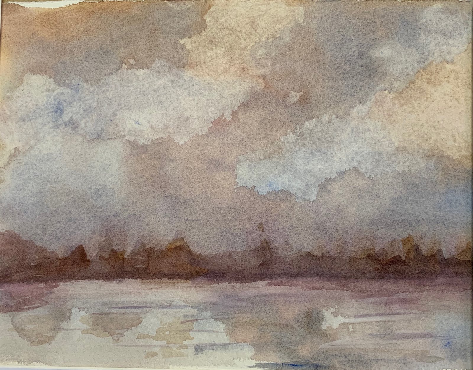
So, I began experimenting...we had had a lot of discussion about triads. I began with wet paper and ultramarine blue, alizarin crimson and aureolin yellow. It's a stormy look with just the suggestion of a horizon.
I let it dry and then darkened the horizon line and added a few more lines to the water.
The thing about triads that I am learning is that the same colors can represent so many different moods. This sky painting uses the same colors and is the more 'traditional sky.'
I again began with very wet paper. Obviously, I used lots more blue in this one. This particular blue granulates and adds texture to the sky. You can see the streaks of color. I don't much like this one - I think it's boring...
On to one more...I do think yellow skies are interesting.
I cut back on the blue - except to add it to yellow and make some green fields. I started to make a structure in the background and ended up just leaving it. I may go back to this one day and tweak it some more. This reminds me a little of the vistas in the midwest. You can see for miles!
Now, a teaser for my next blog. I did one more sky when I got to my class the following week. It is quite dramatic and deserves it own post. As 'they' say..."Stay tuned!"