Monday, December 14, 2015

Merry Christmas

The holiday season is certainly here...life is busy, but not frantic at our house. With the temperature in the upper 60's, it doesn't feel like Christmas, but the calendar belies that! It's Christmas card time.

I'm ready this year - last summer I had this idea... I was feeling a little 'sassy' and thinking "Wouldn't it be great to get the card done early?" No pressure, just play with an idea and see.

So, I did this watercolor and ink painting of the alphabet. I decorated each letter with a Santa hat and ornament or ribbon. This is the front of the card.


Okay, something is missing... open the card and it says...

Merry Christmas, everyone!


Saturday, December 5, 2015

The final peppers

Remember the peppers - 10/29 and 11/12 posts? I wondered if I would ever be finished... What I decided after looking at that painting for a long time was that I had killed it. Those fresh peppers were no longer glowing. All the work fiddling with the window behind the peppers had made the painting be about the window - it wasn't what I had intended.

What I know is that it is important to see where a painting goes in spite of me. Sometimes during the process a painting can lead me way off into unintended places and that can be a good thing. The 'happy surprises' of art. However, this time i just ended up with a dull painting. It's best to turn it over and start again (or not).

What was also important for me in this exercise was to try something different. My friends in the watercolor class had made suggestions and I tried them. No, they didn't work for me, but it was good to try something 'out of my box.'

So, what did I do? After all that, I got out a fresh piece of paper. I had already cut a mat, bought glass and a frame for the old painting - didn't want all those things to go to waste. I repainted my original idea.

It's simple, clean and fresh...and it's hanging in the library gallery in St Michaels as part of the watercolor exhibit sponsored by the St MIchaels Art League. The show will be there for the month of December. Stop by and have a look.

"Come on Over"  12 x 22 framed watercolor   $165

Friday, November 27, 2015

Painting loosely

Each year the St Michaels Art League (SMAL) schedules two nationally know painters to come to our area for multi-day workshops. This fall Eric Weigardt came for 5 days. Unfortunately, I had a schedule conflict and was not able to sign up for the workshop. But, I did go one morning to see his demonstration. A few of my friends had taken classes from him and now I know why.

His easy, loose style creates a freshness in his watercolors that is so appealing. He offers a set of videos - which SMAL promptly bought. I have now watched all six - and want to watch them again and again.

One of the videos was on flowers - basically watching the edges and white spaces. Not to worry with all the petals - knowing it is flowers, I just do enough to suggest 'flower.'

Last week I thought it would be fun to just try it. I started with lots of pinks, gradually adding some darker reds. Then threw in some greens (blues and yellows) and painted in the container using the colors I had already used.


After it dried, it looked a little pale - I added some darks and decided to stop and just look at it for several days.


I think there is a wonderful freshness to this. I had a great time  - I want to try this some more.

Thursday, November 12, 2015

Peppers, part II

Yeah, the peppers again... When I took the pepper painting to class the following week, everyone liked it...and then there was a discussion about adding some drama. Some of the students had been using very dark backgrounds in their paintings lately. What would that look like with the peppers?

I agreed the painting could use some darks, so I began experimenting. The voice in my head kept repeating, "It's only paper..." After all, I am taking a class - I need to experiment!

Here is the first attempt. I wanted it to still look like reflected glass...


I didn't like that particularly, so I washed it off and tried again.


Hmmm, maybe a little better. What about solid dark?


Well, that's dramatic all right, but now it's all about the window and not about the peppers! I showed this one to my class this week. They agreed, it was too much. They liked the other two pictured above (I had printed out the various iterations). Suggestion: use a sponge and wipe off some of the dark so the window has the streaked look...and let the streaks cross over the window frame to break up the sharp white lines.


I feel like the little kid in the backseat on a long trip..."Are we there yet?" ...


Thursday, October 29, 2015

"Come on Over" or "Green with Envy"

I received a phone call and was told to bring fruits or veggies to class for a still life painting. I had been at the grocery store the previous day and had spotted some beautiful peppers. I picked out three - a yellow, an orange and a green.

Others had brought a pomegranate and a pineapple. Each of us brought what we wanted to paint, so instead of combining everything for a joint still life, we just individually arranged what we had.

My idea had been to paint the orange and yellow peppers on one side of the paper and the green one by itself.  I was thinking "Come on Over" or "Green with Envy."

The first day I completed the sketch. The following week, it was time to paint. I really wanted to paint loosely, so I purposely held the paint brush a different way and voila, I had the peppers done in no time.

The class loved it and asked, "What else are you going to do?" There were suggestions of adding a dishtowel, or some sort of tiles. That didn't seem quite right. Maybe a window...

I sketched in a window and then worked hard at getting the panes the same size. I used blue painter's tape - which comes off easily ...and arranged and rearranged the panes. My eye gets fooled so easily - they still don't look even, but they are!


Then I pulled off the tape so I could see how it might look.


Last step was painting in the window panes. In keeping with the looseness of the peppers I purposely did not do lots of detail in the window frames. I like the simple look in this one.


So, what you do you think - "Come on Over" or "Green with Envy"...or something else?


Monday, October 5, 2015

BFFs

The process - part 2...the October exhibit at the St Michaels Library was hung last week. I need to get by there and see what the other artists did in describing their processes. Creative people = imaginative ways of doing this 'assignment.'

Today's post is about the pastel that I painted for this exhibit. I haven't done a portrait for awhile so I started looking through old photos. I came across a picture of one of my grandchildren hugging her dog.  She was about 2 at the time. (She's now 16 - don't know how that happened!)

Here's the pencil sketch on 500 grit sanded paper. (FYI - this really is just like sandpaper, but it's archival - not the stuff from my woodworking days)


I love the look of watercolor washes before I begin using my pastels. I try to add just enough color to describe the painting. It helps me find the darks and lights.


After it dried, I began with my soft pastels. Again, I was working on darks and lights and beginning to work on some expression in her face - because I couldn't wait. Normally, that would come later. but i was anxious to try.


I started experimenting with background color. In the photo, they were in the grass.


I finished up the background and kept doodling with her mouth - she has a funny little expression that is peculiar to small children. I think it has something to do with 'baby' cheeks...


The title of this painting is "BFFs" - it seems they were Best Friends Forever.

Friday, September 25, 2015

Creating Art - the Process

The art league will have a new exhibit at the St Michaels Library in October. It's called 'Creating Art - the Process.' I have found it a lot of fun - and good learning  - to document my process in creating a painting. . .now I will get to see how other artists take on this challenge.

So, here is one of the paintings I will be entering in this exhibit. After I painted 'THE Arrangement' (see post of September 10) I thought it would be fun to try taping another piece of watercolor paper. The first painting was horizontal - this one would be vertical.

My idea for this painting was to just use blue and yellow and see what would happen. This first application of color was very wet. I love to see what the colors will do! When watercolor paint dries, the colors are more muted.


I added more color - with less water this time - and let it dry again. Then I removed the tape. (forgot to take a picture before the next step)

I wanted to bring the sections together so I dabbed a sponge in the blue-yellow-green puddles on my palette and crossed over some of the white lines.


It's looking very much like a lattice. I know I am sort of color crazy - I had a teacher once who said "Every painting needs a spot of red." At this point I hear his voice in my head and can't shake it. . . but, I also don't want to ruin what I have done already. 

It's time for the acetate - clear plastic that I can experiment with on top of my painting. I can paint on it and get an idea of what might work. I try a few different ideas. 


Still not right. Then I decided to stop and take this painting to class for suggestions. 

 "Make the flower look like a real flower." "Add a vine. Make it look like it really belongs there."

After googling 'flowering vines and morning glories' (which are NOT always blue/white as I had thought - yea, I can use red),  I made several more acetate tries and came up with this final product.

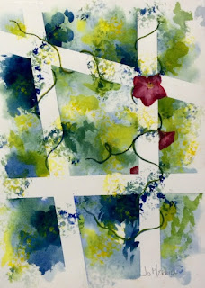
"The Lattice" - 16x20 framed watercolor $175
The exhibit will be hung on October first and run through the month. Drop by, see this painting and find out how other artists create, too!


Wednesday, September 16, 2015

...the week after

Last week I posted about 'THE arrangement." The week after I did that painting, I returned to class. There in the arrangement container were four dead sunflowers and some sort of trailing vine. It was difficult to lift - I guess the oasis was still wet and the container was some sort of heavy metal. Barbara asked us if we would take the whole thing and throw it out for her.

WAIT! The dead flowers had their own beauty - I wanted to paint them. Actually, I thought they were much more interesting than the gorgeous arrangement. Needless to say, I was delighted to have found something to paint that I was excited about. (I don't know what that says about ME that I thought the dead stuff more interesting . . .as they say, "I'm not going there.")

So, here is my offering today. I really like the loose, free look.


'The Day After' 8x10 watercolor  $55

It is framed and hanging on the wall at The News Center in Easton. Drop by there to see it in person and take a look at the other small paintings hanging there. That show is up until the end of September.

Thursday, September 10, 2015

THE Arrangement

There was a wedding at my church a couple of weeks ago on a Saturday afternoon. When we arrived for our regular service the following day, we were overwhelmed by the beauty and the abundance of flowers. They were everywhere and they were magnificent! At the end of the service, parishioners were invited to take the flowers home, to give them to shut-ins, to share their beauty.

The next day, I received an email that said "Barbara brought some flowers home from church. Bring a BIG piece of paper to class. We'll be painting an enormous arrangement." I groaned . . .all the arrangements that I had seen were of white flowers . . .and there were so many! I was not looking forward to class that Tuesday.

I am NOT an easy flower painter. I get lost in so many petals.

So, imagine my surprise, when I arrived at class a day later to find, yes, an enormous arrangement - BUT they were NOT the white flowers. It was an amazing display of sunflowers and all sorts of color!

OK, still, I am NOT an easy flower painter (I said that before)  - what was I going to do with the overwhelming mass of color?

I decided to get out of my rut and experiment a bit.  A week or so before (when I had not been there) the class had taped sort of a grid on their paintings. Later they removed the tape and connected the squares to form a whole painting. It sounded like fun.

I started to tape and decided not to just do a rectangular grid. Sorry, I don't have a before picture here. I began to paint the flower display, purposefully leaving out a lot of the various flowers. It was just too much!

When the painting dried, I removed the tape and began connecting the arrangement. I added stems and greenery and voila! Not too bad after all.

"The Arrangement"   11x14 watercolor & ink    $125
To be continued . . .

Monday, August 31, 2015

Art Show & Sale this weekend!

Labor Day weekend is coming up - that means it is time for the SMAL annual Art Show and Sale in St MIchaels, MD. I have been a member of the art league for a number of years and have attended the show, but this year I decided to be one of the exhibitors!  Hmmm, what do I hang?

Since I have been 'playing' with different things this summer, I am going to take a leap and put some of the experimental paintings in the show. I really have enjoyed the crinkled paper paintings, so they will go in. I also scanned some old favorites and have printed them on watercolor paper  - they are matted 8x10 and will be sold as unframed prints.

Now for my newest crinkle . . .when we were in Vermont this summer, I was intrigued with the blueberry bushes at our rental house. The berries were in different stages of 'ripeness' and the colors were wonderful. So, my latest crinkle painting is called 'Blueberries.'

'Blueberries'   framed 11x14 watercolor  $175
The show is on Saturday, September 5 from 10-5 and on Sunday, September 6 from 12:30-5:00 under the tent on the lawn of St Luke's United Methodist Church - right in the center of town. Hope you will stop buy. You will find many very talented artists there to greet you.


Thursday, August 13, 2015

Vacation = Grandchildren = Creativity

We have just returned from a trip to Vermont where we visited with two of our grandchildren. Twelve year old Kieran and I spent lots of time with his Kindle Fire and my iPad.

After patiently explaining some of the games that he and his friends play, he showed me a picture that he 'painted' on his kindle. I asked if I could post it - he said 'yes.'


I was impressed with what he had done and showed him a drawing app on my iPad. I had not done too much with it  . . . but he figured it out and taught me a few things. 

He wanted to do a self portrait. First he took a picture of himself and used it as the first layer. He then used the paint brush on the drawing app and voila! There he is.

He really had fun with it and worked with his sister Maizie to capture her, too.

As they say, "A fun time was had by all!" It's wonderful to learn new things from a different generation!


Tuesday, July 28, 2015

Small Paintings - at The News Center in Easton, MD


One of the fun and interesting things about painting is to revisit old work. I tend to put old paintings aside in a pile or a box (out of sight).  Occasionally though, I get them out to remind myself that indeed I have learned something over the past several years!

There are surprises as I look at these old paintings - "That's pretty good. How did I do that? "or "That's embarrassingly awful. Why didn't I destroy that?" or "This one's not too bad. Is it fixable?"

Recently, the artists in the watercolor class that I sometimes attend started looking at our old paintings - particularly some that were just not quite right. They may have even been 'turnovers' - paintings we couldn't stand and turned them over to paint on the back.

Using a small mat, we went over each one with an eye to finding a small painting within the larger one. As we did this, an idea was born. What about a show/exhibit of small paintings? That spurred us on to look at more paintings and the show began to take shape!

I looked at several old paintings with new eyes and found some fun small studies. I reframed a few other things in a smaller format and am ready to go!

Here are three of the eight paintings I am putting in the show.


"Fall Tree" 8x10 watercolor
 Oops! Looks like I took this photo on a strange angle. Sorry . . .

"Spring Tree" 8x10 watercolor

"Garden Arch" 8x10 watercolor & ink
The show will be hung on Saturday, August 1 at the News Center  - 218 N. Washington St. (in the Talbottown Shopping Center), Easton, MD.  It will run for 2 months, so YOU have an opportunity to drop by and do a little early Christmas shopping!  Enjoy.


Saturday, July 11, 2015

A Crinkled Tree

Warning - I'm still partially in my 'crinkled paper' phase. While I was doing all the abstract-playing-with-color, I was also wondering about drawing/painting a 'thing' that I could recognize.

I began again with very wet crinkled paper. As I may have said before, watercolor paint flows onto wet paper beautifully - laying down vivid color. When it dries, it usually becomes more muted. Since I wanted to try lots of colors, I decided to paint a fall tree. I stuck a practice mat on it just to see how it might look.


It was OK, but of course, I had to fiddle with it! The next day, when it was really dry, I added more paint and defined the tree a little more. It now looks like this!


Hmmm, interesting . . . I stuck it in a frame and will continue to look at it for awhile. I kind of like it.

Thursday, July 2, 2015

ArtHunt - an invitation for fun!

It's now July and time for the St Michaels Art League's second annual ArtHunt! Seventeen of our artists have each loaned a painting which is now 'hidden in plain sight' in one of the seventeen participating stores in St Michaels.

All you need to do is pick up an ArtHunt card in one of the stores or at the Welcome Kiosk and find all the paintings. Each store will stamp your card when you discover a painting.

When your card is filled with stamps - take it to Justine's Ice Cream Parlour for a FREE treat. (Thank you, Justine's!)

And, why am I so excited about this? I have a painting in one of the stores. I'm not telling you which one. You have to find it.

"America's Favorites"  9x12 pastel   - unframed $150


 Here is what the ArtHunt card looks like. 


Grab a friend, grandchild or just anybody off the street and go on the hunt. It's only for the month of July . . .have FUN!

For more information about SMAL go to smartleague.org


Saturday, June 27, 2015

More softer edges

Yes, more crinkled paper.

While I was experimenting with the 'flowers' from the last couple of posts, I was also working on another painting. I wanted to try something with a little different look. I began again with a very wet piece of crinkled paper. I dropped some reds and yellows  - mixed them a little to get the orange - and watched the pigment flow around the crinkles. I love to watch the way watercolors find their way around the paper.

It needed some darks. I knew I wanted to do something unlike me. (I find myself always going to primary colors)  So instead of red, yellow, blue. . . I dropped some purples into the mix. And, then I let the colors explore the paper. The paper is still wet - the edges are beautifully soft.

I put it aside to dry. Normally, when watercolor dries the colors become more muted. Surprisingly, these colors stayed fairly vibrant. But, it needed something to bring it together.

Maybe some lifting of color . . . I wet my brush with clear water and lifted some straight lines. Hmmm, a good start - then I added two arcs. Interesting.

11x14 matted watercolor - untitled  $75

Maybe that's all that it needs . . . I might just let it be for awhile.

Monday, June 22, 2015

Possibilities - Chapter Three!

My last post was part two of my 'crinkled paper phase' . . .I keep experimenting. After washing off my last effort, I let the paper dry for a couple days and then went back to it today.

I think what I liked about it after washing it off was the softer edges  - the bolder colors were great, but there was something about all the hard edges that I thought I would like, but didn't. Hmmm, more playing to be done.

I re-wet the paper and began floating some darks around what I had thought of as 'flowers.' The edges did soften. I then added more color to the spidery starbursts! This is what watercolor does best - wonderful color surprises.

I tried cropping it a little differently and stood back to give it a look.  Now I am seeing colorful jellyfish floating in dark water - or maybe just fuzzier flowers?

8x10 matted watercolor - "Emerging Flowers"   $40


Any thoughts?  What do you see? Is it ready for a signature and frame?

Wednesday, June 17, 2015

Playing with possibilities - Chapter Two

Picking up from Chapter one (see previous post) . . . after I had looked at several possibilities of cropping the crinkled paper painting, I happened to turn the paper over!

WOW - on the reverse side were more possibilities. Since the paper is relatively thin, the paint from the front side had bled through and made some very interesting tracings of color. The color followed the creases in the paper and looked a little like bursts of pastel color.

Unfortunately, at this point I did not stop and take a photo of the reverse side of this painting. It would be fun to just see the starbursts.

As I stared at this new revelation, I saw flowers . . . Perhaps a little "negative painting" (painting around the 'thing' rather than painting the 'thing.') would bring them out.


Can you see the starbursts of color?

I think there are too many flowers here. I got a little carried away.

What if I crop this in different ways?


Better - less busy, but still not something I want to sign and frame. Maybe too bold? The voice in my head reminds me that "It's only paper" so I washed it off.


Not sure what to do next - going to let it sit for another day or two and then play with it some more.

I'm in my crushed paper phase. Stay tuned for Chapter Three . . .

Monday, June 15, 2015

Playing with possibilities - Chapter one

It's summer - the busyness of my life is slowing down a bit. Ahhh, time to play.

A year or so ago, a friend gave me several sheets of 90 pound watercolor paper. It is much lighter than what I usually paint on and I wasn't sure what to do with it. "Wet it," she said, "and crinkle it up. You'll be intrigued by the texture."

Hmmm, interesting idea. I decided to experiment. I soaked the paper and crushed it into a tight ball. Then I unfolded the ball and looked at a very messed up piece of paper!  Well, I had gone this far, why not give it a try. While the paper was still very wet and wrinkled I dropped color on it.


The color settled in the creases and also spread in other surprising directions. 

There may be possibilities for cropping and having some fascinating abstracts here. Try rotating this in different directions and/or using just sections . . .


Playing with possibilities! Having lots of fun.

And then I discovered something else . . .more possibilities for another day.  Tune in for the second chapter to this story . . .next post coming soon.


Friday, June 5, 2015

Congratulations, Grads!

Where has the time gone? I try to post twice a month and ...I am embarrassed to see that my last post was more than a month ago. Sometimes 'life' gets in the way.

Recently I was talking to a friend whose daughter is graduating from high school. It's a time of very mixed emotions - pride/happiness that her daughter has done so well, and anticipated sadness/emptiness that she will be leaving for college in the fall.

We had been sent an invitation to an open house celebration honoring her daughter. Unfortunately, we are unable to go, but I wanted to do something to recognize the occasion.

While we were talking, Marianne said something to me about my artwork and mentioned that she really liked my crabs. "I need one of your crabs."

So, here you are, Marianne.  Happy Graduation to Mom (and Felicia, too)


Sunday, May 3, 2015

"Uncle Wally"

For many years we had a dog named Spunky. She was a mixed breed - called a 'mutt' by some. We were told that her mother was a Golden Retriever and her father a German Shepherd Husky. She was the perfect mix of all those breeds - gentle with children, a true member of the family.

We were sold on mixed breeds - 'mutts.'

So, when my daughter told us that her family was getting a dog from a breeder, we were skeptical.  There were looking for a Cavapoo - it's a mixed breed - a Cavalier King Charles Spaniel and Toy Poodle. The internet describes them this way: "Cavaliers are known for their amazing temperament.  They love being with people and other pets.  Cavapoos combine the wonderful temperament of the Cavalier with the non-shedding coat and intelligence of the Toy Poodle."

Having had a Golden Retriever and vacuuming everyday, my daughter really liked the 'non-shedding coat' idea.

Along came "Uncle Wally"...a little ball of hair. Yes, hair, not fur - he doesn't shed and is absolutely adorable.


Over the years we have watched him do all sorts of crazy things. He goes a little nuts barking and leaping to follow light. We sometimes tease him by shining a flashlight or reflect a shiny object around the room. He seems to enjoy the game  - his delight is also ours. And then, we often see him licking the wall - that we have never figured out...but he seems a very happy little guy!

This painting is part of the St Michaels Art League Members' Exhibit at the St Michaels Library during the month of May. Stop by and see all the art work on display!

Sunday, April 19, 2015

Spring Break 2015

We are recently back from our annual 'Spring Break' vacation trip. For the past several years we have been invited to join my daughter's family for a week in Florida. This year we had perfect weather - a whole week of sunny skies and temperatures on the 80's.

There is beach time - sitting in the sun, playing in the water, walks in the sand and a bit of lacrosse.

There is pool time - floating around on rafts, playing ball, reading in comfy chairs and diving for coins thrown in by whatever adult is nearby.

There is game time - a deck of cards can spark a lot of competition... as can the great board games - Sorry and Clue.

There is art time - there seems to be less of this in the last year or two. I think we (all of us) are better able to sit and read or just play together. Art is 'on vacation'... except for the youngest granddaughter who still is interested in painting in my sketchbook.

She was into doing all kinds of 'happy faces' - and using lots of color!


I did a quick sketch of the games we played.


Good memories of a fun week together!

Monday, March 23, 2015

Get ready to smile out loud...

I just love the English language and the wonderful variety of options we have to create images around words. I began with baseball terms a week or so ago and find that I keep thinking up more paintings...

I was driving home yesterday and came up with this one to add to the collection that I recently posted. Yeah, I usually don't post this often, but just can't stop thinking up these things. I may need to get away from my easel soon and get out in the garden. The daffodils are almost ready to bloom - it truly must be spring.

Use you imaginations - think baseball terms. Do you know what this is???


And, since I seem to be in this 'silly' mood, take a look at what I saw on my iPad the other day when I checked my email. Look closely at the line below "The Artist's Brain."  


Maybe that's been the issue all along - my brain in empty!

Okay - since you haven't guessed the title of the dancing chickens... it's "The Fowl Line"